Most graphic tees you see in the wild fell out of a giant printing machine somewhere. A vendor uploaded artwork, a contract printer ran a thousand of them, and a warehouse shoved them into shipping boxes. The idea, if there ever was one, got blurred at every step.
That's not how we make ours. Every design in our tee collection goes through a slow, deliberate process that starts at one desk in a small Los Angeles studio and ends with a shirt that exists because someone actually wanted that exact idea on cotton. Here's what that process actually looks like - the parts that are interesting, the parts that are tedious, and the parts where I almost always end up tearing something up.
It usually starts as a sentence, not a sketch
People assume design starts with a drawing. For us it almost never does. It starts with a single sentence in a notes app - usually written at an inconvenient time, like 11 p.m. on a Tuesday or in the parking lot of a grocery store.
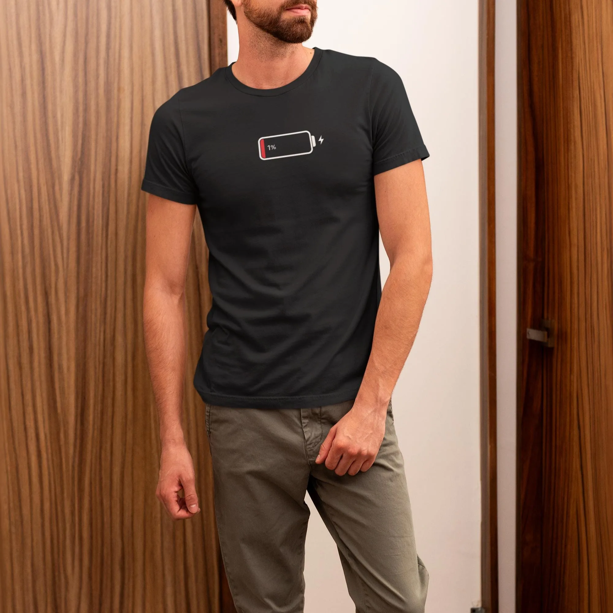
The 1% Low Battery tee started as the sentence "I am the human version of a phone at one percent." That was the whole thing. No image, no font, no layout decision. Just a feeling I'd had every Wednesday for about three years, written down because I happened to have my phone open.
Most of those sentences die. They look great in a notes app and stupid the next morning. Maybe one in ten survives a week. One in twenty makes it to a real design file. The hit rate is brutal, and that's the point - if every idea made it to a finished shirt, the catalog would be full of things nobody actually wants on their body.
Sketch to screen is a longer detour than people expect
Once a sentence survives, it moves to paper. Pen, not pencil - pencil is for things you might erase, and at this stage erasing is procrastination. The first sketch is intentionally rough. It's not the design. It's a question the design has to answer: "What does this feeling look like?"
The bass guitar tees all went through this. The line "dibs on the bass" doesn't immediately tell you what to draw. So the first sketch was just the words in three different layouts: stacked, side by side, and overlapping. The overlapping version felt right because it had the same energy as someone aggressively planting their flag - but I didn't know that until I drew it.
Digital iteration comes next, and this is where most of the time goes. Forty, fifty rounds of micro-adjustments. Font choice, kerning, line weight, negative space, where the bottom edge of the design lands relative to the chest pocket if there were one. Almost none of that work is visible in the final design. But you'd feel the absence of it the first time you tried to wear something where the kerning was wrong.
The color problem nobody talks about
This is the part of the process I lost the most sleep over in the first year. Colors on a screen and colors on a shirt are not the same thing, and direct-to-garment ink behaves differently on every fabric color.
A design that looks crisp on a black tee can disappear on forest green. A design that looks bold on white can wash out on pebble brown. Every design has to be tested against every color the shirt comes in, and the testing has to happen on real fabric - pixels lie. The low-battery tee comes in seven colors specifically because those are the seven where the design actually held up. We tested eleven.
Sample prints, real shirts, real laundry
Once the design is finalized and the colorways are settled, the first physical sample gets printed. That sample doesn't go on the site, doesn't go on Etsy, doesn't get photographed. It goes in the laundry.
Three wash cycles, all the wrong way on purpose - hot water, the wrong detergent, full sun drying. If the print survives the bad version of laundry, it will survive whatever a customer actually does to it. If it doesn't, the print process gets adjusted before the design ever goes live.
The milestone birthday shirts in particular get this treatment, because if someone is buying a 60th birthday shirt for a once-in-a-lifetime party, it can't fade on the first wash. That's not a product, it's an embarrassment.
Photos, listings, and the moment it goes live
Photography is the step most makers underestimate. We didn't, but only because we got it wrong on the first three releases. Two flat-lay shots and an on-model image is the minimum, and both have to be lit by daylight, not whatever the kitchen ceiling is offering at 2 p.m. on a Thursday.
The listing copy comes next, and it almost always takes longer than expected. Every shirt needs a name, a description, a set of tags, a meta title and meta description for search engines, and a story that explains why this design exists. We try not to use the words "premium" or "bold" because those words don't mean anything anymore. We mostly fail.
Then the design goes live. Etsy listing first, then on this site as part of the main catalog. The first sale is always silent - no fanfare, just a notification on a phone. The second sale is the one that means something, because that's the one where someone who didn't know us bought it.
What you don't see on the product page
You don't see the eight designs that didn't make it. You don't see the color tests that got abandoned. You don't see the sample shirt that's currently in a drawer because the kerning came out half a millimeter too tight and now I can't unsee it. You don't see the wash tests, the photography reshoots, the listing rewrites, or the half-completed designs that have been sitting in a folder for fourteen months because the joke is right but the execution isn't there yet.
What you see is the finished shirt. Which is the point. It should feel inevitable - like it couldn't have looked any other way, and like it took an afternoon to make. The fact that it didn't is the part of the process that's nobody else's problem.
If you're curious about how the studio actually runs, or you want to browse what made it through the gauntlet, both are a click away.